responsive design
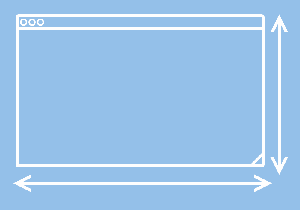
Optimal viewing, where web pages work equally well on every type of device, has made reading and navigating the internet a whole lot better. Especially for those of us who use a smartphone as our primary online tool. How does responsive design work? Designers use fluid grids (ie shrinking columns), flexible images and media queries (content adaptation) so everything automatically adjusts and resizes to fit whatever screen we’re using. Simply put, it’s the next step forward.